Making your presentation content starts with your slides themselves. The two main areas I work on is the amount of text on each slide and the format of the text and slide background together.
TIP #1: Use Less Bullet Points
I have blogged before about the book "Beyond Bullet Points" that has some good ideas about presentation styles. I do not agree with all of them, but I do try to have as little purely bullet point slides in my presentations now. Here is a simple, single slide with multiple bullet points. It is very bland and the content blends together. With more content the font size has to get smaller and it gets hard for people to see.

So I take a slide like this one and split it into multiple slides. The title of the bullet point list would be on a separate, distinctly formatted slide to set it apart as the title (or theme) for the next series of slides. Each bullet point would get it's own slide. This way the font size can be much larger so that the text is easy to read. I try to keep each sentence fairly small and simple to that it can be read quickly. Using contrasting font colors to stress the primary words helps also. There is also usually enough room to add a graphic or animation that helps bring home the point of the slide. Here are some slides formatted in this style.

TIP #2: Use Dark Backgrounds and Light Font Color Schemes
You can search the web and find just as many people telling you to use dark text on a light background as you will people with the opposite view. For printed materials dark text and light background is the easiest thing to read in ambient light, but in a dimly lit room with the content projected on a screen the opposite is true and this post does a good job of explaining the reasons why. To prove the point take a look at the images below.

Imagine that you are in a dark room and you are viewing dark text on a white background. Your eye actually take in the outline of the white container first, then view the text. With a dark background that can blend into the dark room, the light colored text is the initial focus.
I also use a pattern in the background like a subtle gradient or waves that helps break up the slide a bit more.
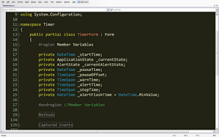
TIP #3: Format the Visual Studio Editor to Use a Larger Font and a More Viewable Color Scheme
In most of my presentations I am showing code in Visual Studio. This is usually the hardest thing for someone a few rows back to see. I do a couple of things to make this easier for them.
- Increase the font size - I normally go 20 pt for the font size to make sure even the people in the cheap seats can see. The default font looks pretty bad at that size so I also change the font to Consolas which looks pretty good at that size.
- Change colors - Just like the slides, I change my colors to be lighter text on a dark background. I found a nice scheme called Midtone from Coding Horror that I like.
 Once I have it setup the way I like it I export the settings so that I can switch to them when I give a presentation (since I do not code normally with my font at 20pt).
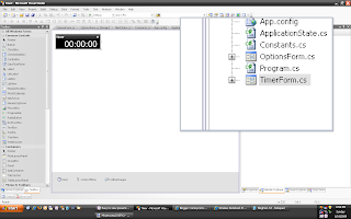
When I open a section of code to show, I also switch to full screen mode by pressing Shift + Alt + Enter which hides everything bu the main menu to give me the most screen real estate for showing the code.
TIP #4: Use a Mouse Magnifier
Unless you are using your original PS2 mouse from 1997, you probably have a mouse with extra buttons that can be mapped to all sorts of neat features. I use the Microsoft Presenter Mouse which is great for giving presentations. It comes with Microsoft Intellipoint (which you can download for free) which allows me to map one of the extra buttons to a magnifier. Since often all I can enlarge is the font in Visual Studio and other applications, if I have to show a toolbar or icon I can use the magnifier to enlarge a section of the screen to make it more visible.

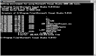
TIP #5: Format Your Command Prompt for Larger Fonts and More Screen Space
Quite often I open a command prompt to show something at the command line. Just like viewing code, by default these windows are hard to see in a presentation. You can open the command prompt (I normally use the Visual Studio 2008 Command Prompt) you can right click on the title bar and choose Options.

In these options you can increase the font size as well as the size of the window although I try to go full screen. When you save your changes you can choose "Modify the shortcut that started this window" so that the next time you use that shortcut you will have the same settings.
Conclusion
I have found the above techniques make my presentations much easier to view in large, dimly lit rooms. Your attendees are going to thank you!
No comments:
Post a Comment