Friday, August 24, 2012

Super Fantastic Product Backlog Goodness!

Do you love your Product Backlog? Do you stare at it for long periods of time with a dreamy look in your eye? Does the mere whisper of its User Stories make you shiver with delight?

No?

Don’t feel bad. Most of us don’t either. A good Product Backlog is hard to find and even harder to keep up. So how can we get to the point of “Super Fantastic Product Backlog Goodness? (Note: I actually have no legal trademark over this phrase, but I should because it is totally awesome.) Here’s a few ideas of how to build and maintain a better backlog:

It All Starts With The Product Owner

Since the Product Backlog is the responsibility of the Product Owner, it goes without saying that their ability and availability have a significant affect on the quality of your backlog. Stay tuned for a more in depth posting about choosing the right Product Owner.

Writing Good User Stories

2332175
There are plenty of good posts and online resources around writing good User Stories so I will only hit the high points:
  • Size – One of the biggest problems I have seen teams struggle with is sizing stories appropriately. What size is appropriate? Well that depends mostly on your team. A good rule of thumb is that a story should be no larger than what you can finish in half a Sprint. I mostly see teams err on the side of too large since they have a hard time thinking a smaller story add legitimate value on its own.
  • Roles & Personas – Too many times I see stories start with “As a user..”. Who is this user you speak of? Even if this story does apply to every single use who will ever use the system, the subtleties of how they interact with he system and what they expect can be different and imply other design considerations. Be sure to spend some due diligence figuring out the various types of roles for your application and some specific personas who would fulfill those roles.
  • Clear Value – The third part of the User Story that outlines the benefit the user will gain from the described feature is often the hardest one to document. Smaller stories may seem to share the same benefit (and in some cases actually may), but don’t gloss over this part. Specifying the benefit of the feature helps with prioritization as well as giving the Scrum Team a better idea of why they are developing it.
  • Acceptance Criteria – Even more so than the actual story itself, the Conditions of Acceptance are key for giving the Scrum Team a better idea of how the feature should work when complete which leads to better estimates, better test cases, and a idea of when the feature is complete. As a story is groomed and given more detail, turning these into actual high level test cases is a good way to make sure the team has a clear vision of how to meet the needs of the users.

Grooming The Product Backlog

The Product Backlog is not an artifact you work on at the start of the project and then ignore for the remainder. You  constantly groom the backlog, adding to it, reprioritizing it, and gathering the appropriate amount of detail as stories rise to the top (more on this later). If you do not spend a fair amount of time grooming the backlog it can grow into a gnarly Phil Spector-ish mess.
phil-spector-crazy-hair
Most Scrum pundits proclaim a Scrum Team should spend 10% to 15% of the Sprint estimating the items on the backlog with the Product Owner. If you are running two week Sprints then that is almost 6 hours. I normally suggest breaking it up into two separate sessions so that if in the first one there are questions from the team the Product Owner has time to get answers. There is not a team I have met yet that does not initially balk at that. “Two more meetings each Sprint?!?! I’d rather spend that time coding.” You are going to spend the time either way.

When you are estimating stories, you are reviewing them together, discussing your approach, clarifying business requirements, etc. This information is invaluable for getting solid estimates and for helping to ensure you don’t get sucker punched in the middle of a Sprint due to an ambiguous story that suddenly becomes much bigger than expected. If that happens you will definitely spend more than a few hours figuring it out in the Sprint and jeopardizing other stories in that Sprint in the process.

Along with the Scrum Team dedicating time for estimating, the Product Owner must also dedicate time towards grooming the backlog each Sprint. This means holding story sessions with the stakeholders and users to get new stories, reviewing the priority of the backlog, and gathering more detail on stories that are high enough on the backlog to be slated for the next 2 or 3 Sprints. This is where the availability of the Product Owner becomes crucial. Poorly groomed stories tend to take the Scrum Team by surprise in Sprint Planning which causes them to be poorly implemented or run long.

Not All User Stories Are Created Equal


The big myth about Agile is that it allows you to “get more stuff done faster with less people”. Not true. And if someone tells you that you should punch them in the ear. Agile is supposed to help you get the important things done quickly with probably about the same amount of people. (If you disagree then you can find me and punch me in the ear.)

To ensure that you do the most important stuff first you must prioritize your Product Backlog items. This does not mean applying some business value metric and the sorting your backlog on it. The value of a backlog item has many different variables: business value to the user/company, the effort to deliver the feature, the ROI (business value divided by the estimated effort), it relation to other features that may need to come before it, and less tangible factors such as politics and solar flares. And on top of that it can change frequently. So prioritization needs to be part of any regular grooming.

A friend of mine compared a well prioritized backlog to a PEZ dispenser: you pop back the top and the delicious candy on top pops out!

PezDispenser

Be Ready To Throw It All Away

Remember that a good User Story is a “reminder of a conversation”. It is not a specification to be strictly adhered to. Once you commit to a story and start working on it during the Sprint, the team and the Product Owner can refine it as needed. Any effort you put into detailing a Product Backlog item is potentially wasted time if done too early in the process and in too much depth. Try not to get too hung up on  the story and beware of sayings like “Where does it say that in the story?”.
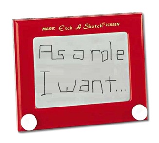
etch_a_sketch
If the story says A + B = C, but while you are developing it the team and the Product Owner find that A + B = X then that is what it is. Do you go back to the story and change it? In my opinion, no. So where would you capture this change? In the test cases. This should be tested for in some kind of test (unit, integration, feature, whatever). Static documentation of a story can grow stale if not constantly updated and let’s face it, who the hell wants to update documentation? A test, on the other hand, verifies what the code does and as we all know “the code is the truth!”

Now Go Be Super Fantastic!

Hopefully these ideas will help you go make your own totally awesome backlog! I’ll explore implementing a good deal of these concepts in Team Foundation Server in an upcoming post.

More Than Just 3 Questions: Getting the Most Out of Your Daily Scrums

The Daily Scrum is probably the most widely adopted mechanism in the Scrum arsenal. For good reason as it is a great communication and tracking tool for even non-Agile projects. Unfortunately people think that if they ask the standard three questions ("What did you do yesterday?", "What will you do today?", and "Are there any impediments preventing you from completing your work?") and keep it under 15 minutes then they are doing it correctly and getting the most out of this meeting.

While you might be abiding to the two basic rules above, this does not necessarily mean these meetings are beneficial. All too often the mechanism of this meeting is implemented without much regard to the underlying concepts that support it. Here are some tips and ideas around Daily Scrums I have gathered over the years I think help you get the most out of them:

The Daily Scrum is for the Team

This meeting is not for reporting to the Scrum Master or anyone else for that matter. While anyone (including Chickens if they behave) can attend, the team members are reporting to each other. Sometimes just the mere presence of a VP or other manager causes the team to feel like they are giving a status update to this person. This often results in the chicken feeling the same way and emboldens them to ask clarifying questions or start directing the meeting. It may be as subtle as them moving it along by asking the next person to start, but it can quickly turn the orientation of the meeting. I see this most often if the Scrum Master cannot be present and an attending chicken thinks someone needs to be "in charge".

To prevent this (and its hard to do when you report to these chickens in some way) try a few of these suggestions:
  • Remind everyone that only the scrum team and the Scrum Master are allowed to talk during this meeting. After everyone has given their updates, then questions and clarifications can be asked but everyone else can leave.
  • If possible, position the team in an “inner circle” and have chickens behind them outside of the circle. It is a subtle physical reminder of who the meeting is intended for.
  • I also think that even chickens need to be standing, but a good argument for not making them stand is to have another physical reminder.
  • Even with the Scrum Master present, the team should take charge in starting and moving the meeting along. When the Scrum Master does this, it can still make it feel like you are reporting to them and if the Scrum Master is also a member of management it makes it even harder to break the habit.

Use a Task Board

All too often with Scrum teams that do not use a task board for their Daily Scrums you here things like “I finished the widget class yesterday” and depending on how integrated the team is some of us may have no idea what the widget class is exactly and the fact that is it done does not give us any kind of clear picture of the progress for the User Story it belongs to. This is even less clear when you use a Agile management tool and people report things like “I finished task 24533 yesterday". If you are not intimately involved in that particular story you have no real reference to determine how it is progressing.

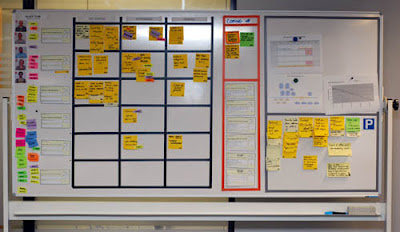
By using a story board you can get an idea of how a story is progressing even if you do not have any knowledge about it. By merely seeing the flow of tasks in their various states you can determine how much of it is done.

It is also easier to identify issues with stories with a task board. If someone has been reporting on the same 6 hour task for 3 days it becomes very clear there is an issue. Is there an impediment keeping them from finishing this task? Was the task originally scoped too small? Is this joker some kind of slacker? Even when people do not know they are in trouble the task board can identify the issue and them team can act appropriately.

(Note: I am planning a follow up blog post just about task boards later with more details.)

Another practice that deviates from the normal Daily Scrum rules is “walking the board”. Instead of asking the 3 questions, the team walks through each story on the backlog and says what tasks were done for each one, what is going to be started, and any impediments for that story. I was not a big fan of this at first when a client started doing it, but I think in some cases it works really well. If you do try this be careful that everyone on the team is participating since your attention is to the story and not the individual members.

Use Information Radiators

Per Alistair Cockburn  an information radiator is something that show valuable project metrics that can be gained to a casual observer with a glance. This would include items like:
  • Sprint Burndown Chart – A graph showing the hours remaining from the Sprint Backlog for each day of the sprint. Good for monitoring how the flow of the tasks is going.
  • Story Burndown Chart – Similar to the sprint burndown but instead of showing remaining hours per day it shows unfinished stories.
  • Task Board – The task board itself is a good indication of how the project is doing per story.
  • Build Status – Whether you use something like Brian the Build Bunny or simply track builds passing and failing on a graph, this can alert you to problems with code quality.
Placing information radiators like these in the Daily Scrum area help the team be aware of the status of the project on a daily basis. Make sure they get updated frequently to provide the most value.


Try It, You’ll Like It!

These are just a few ideas to try and remember that what has worked for my teams in the past may not work exactly the same for yours. For a quick test to see if you are getting good information from these meetings, gather the team after one of them (away from the room so they cannot cheat and look at any of the information radiators) and ask them questions like “how is the project going?”, “are we on target to reach our sprint goal?”, and “what is team member xyz working on today?” If your team members cannot answer these questions with a significant degree of confidence then they are probably not getting the most out of the meetings.

Scrum Masters are Like Referees

Photo of a Referee - Penalty It almost never fails as a company begins to adopt Scrum there is a mad dash of people going to Certified Scrum Master training and dubbing themselves ScrumMasters. Often this comes from a vague understanding of what a ScrumMaster actually does and the misconception that they run the project. The most likely culprits are project managers, product managers, and just plain ole managers who fear their position of authority might be usurped if Scrum is adopted to the letter at their organization. And depending on the organization, they might be right (or at least their role would change quite a bit).

At one client a would be Scrum Master told me "I coach the team like a football coach. I tell them what to do." No, the ScrumMaster is not the coach in the team sport sense of the word. If we want to equate it the sports world the almost perfect parallel is the referee. A referee makes sure the teams play by the rules and that nothing interferes with the game. Scrum Masters do coach the team in a mentoring sense, but they don't call the plays.

Let's do a quick side by side comparison:

Referee
(specifically a football referee)
ScrumMaster
Enforces the official league rules of play for the game. Enforces the agreed upon rules for the team's adopted Scrum process.
Does NOT solely dictate the rules, but contributes to their definition along with team owners, coaches, player representatives, etc. Does NOT solely dictate the rules, but contributes to their definition along with management, Product Owners, Scrum Team members, etc.
Ensures the progress of the game is correctly communicated via mechanisms like the down marker, the score board, etc. Ensures the progress of a Sprint is correctly communicated via mechanisms like a sprint task board, burn down charts, etc.
Ensures the timely execution of each play by keeping track of the play clock. Ensures the timely execution of each Sprint by keeping track of the time boxed activities.
Does NOT tell the teams what play to execute. Does NOT tell the Scrum Team was tasks to execute.
Does NOT determine the game plan for the team to implement. Does NOT determine the features a Scrum Team will implement.
Resolves any conflicts and removes any field obstructions to allow the teams to play the best game they can possibly play. Resolves conflicts and removes obstacles so the Scrum Team can develop
Ensures that the plays and game plan executed by the team follow the league rules. Ensures that the tasks (Sprint Backlog) and features (Product Backlog) do conform to the agreed upon rules.
Is not held accountable when a play is botched if all the rules were followed. (Not counting bad calls!) Is not held accountable for a team missing it's goal when all the rules are followed. (Although a good one helps find out why it was missed.)
Wears an ugly black and white uniform. Is free to wear whatever they wish. (Within reason that is…)


Alright, so it is not a 100% perfect match, but the analogy is pretty darn close. The main point is that the ScrumMaster does not lead or control the team. The Scrum Team does that itself. The ScrumMaster does not manage the features and determine which ones the team should work on. The Product Owner does that.
So if you do intend to be a ScrumMaster, pull on your white and black striped shirt and get your whistle ready!
BTW - If you want some canned definitions for the role check out what Mike Cohn and Ken Schwaber have to say. Also, if you ever wondered what the official duties for a football referee were, you can see the NFL's explanation here.

The Ongoing Pursuit of the Perfect Virtual Task Board

PerfectVirtualWhiteBoard
I work in a distributed Scrum environment. Let me clarify. I work in a distributed Scrumbut environment. Half of our team is here in Nashville and the other half is in Mountain View, CA. We work very closely but as anyone who has worked in a similar situation, it is hard to be highly collaborative. I posted previously about how my company has tried to create a workplace that promotes this type of collaboration and they are dedicated to improving it.
Recently I lamented that our daily stand ups were not conveying enough information about what the team was working on and made it my mission to improve them. Since we are located in two different offices (and because some people do not recognize the value as much) we do not use a physical sprint task board. Let me be clear: a physical sprint task board is the bee’s knees and if you can use one, do so.
The Drawbacks of the Physical Task Board
So why do we not use a physical task board? First of all the ability for it to convey information to the entire team is diminished since only one office actual sees it regularly. We do use LifeSize video conferencing during our stand ups, but it is just not practical to zoom in on the task board since the viewers on the other side can’t make out any real detail.
We talked about having two boards, one in each location. This was dismissed since there would be a considerable effort for us to not only keep the two boards in sync, but also keep them in sync with our sprint backlog which we maintain in Team Foundation Server. Before you start quoting the Agile Manifesto’s views on tools, I did admit we are a Scrumbut shop and as a fairly large organization we have a great need to have this data in a digital format.
Now I saw on Jeff Sutherland’s blog a video of a team that used Jira and RFID tags on their cards for a virtual/physical task board that awesome with a capital AWESOME, but fairly impractical for us.
Setting Up the Environment
100_1273[6]
We have a great collaboration area in our office that we wanted to start using for our daily stand ups to take advantage of some of its technology. As I mentioned before there is a LifeSize video conference suite with a 55” LCD TV, remote control cameras with tilt/pan/zoom, and multiple microphones. We also have a SMART Technologies virtual white board which allows us to not only share our desktop with our counterparts in the other office, but they have a matching virtual board there that we can both interact with in real time. This is very cool for collaborative white boarding but we also wanted to try some of the various digital task board applications out there.
100_1281[12]
When we started using this space for the stand ups a few short comings in the arrangement came to light:
  • The video conferencing screen and the virtual white board were side by side on the same wall. This meant when someone was working with the virtual white board, they totally disappeared from the screen and we found ourselves jumping back and forth when we really tried to collaborate. We would love to have them on walls at right angles to each other, but that would require a good deal of construction work for our current space so we are looking into a mounting arm for the TV that we can tilt towards the white board.
  • The area is open to the rest of the office and we have very cool looking (but noisy) open ceilings. We found it hard to hear using the out of the box microphone/speaker that came with the LifeSize and the people on other side had a hard time hearing us. We had several sound dampening menageries installed that help cut down on the ambient noise, but in the end the best solution was purchasing two small microphones with long cords that could be placed deeper into the open area to pick up everyone talking better and we routed the audio from the other side through the TV speakers.
  • At first the video from our side was very dark due to the “cool” mood lighting the workspace designers had installed. These were soft glowing rings on the walls and hanging from the ceiling that did not provide very good lighting and gave you crazy patterns over your eyes when you stared at them too long and blinked. We removed these lights and installed brighter light fixtures. We thought this would cure our video quality problems but then we noticed that we now had very well lit video that was very fuzzy. The cool pan/tilt/zoom camera has an auto focus feature that was freaking out since the space is so open it cannot determine what to focus on. It did not help that the floor and the chairs in the area all have different, complex patterns on them. We found a sweet spot to zoom in that makes it clear but only gives you a narrow field of view. We are currently working with the LifeSize support team to find a better solution. We have also started using their stationary camera that does not have auto focus so it is clear but we have to manually move it around.
Despite some of these difficulties, these tools are great for gaining some of the individual interactions and collaboration back with a distributed team.
Virtual Sprint Task Board Software
Once we had our space setup we started using it for daily stand ups and tried using a few of the virtual sprint task board applications out there. We had a few requirements starting off:
  • It had to integrate with Team Foundation Server and support the Conchango process template.
  • Our project is currently on TFS 2008, but we are migrating to 2010 soon so we wanted something that could work with both versions.
  • We preferred not to install anything on the actual TFS server.
  • We preferred free software since this was at the time my personal pet project so it was not funded.
With that in mind we looked at a these applications:
Conchango’s Virtual Task Board
TaskBoard001
Pros:
  • Shows tasks grouped by User Story/Bug – I think this is a must since a major purpose of the board is to convey the progress of the product backlog items you have chosen to implement during the sprint.
  • Zoom In/Out – We sometimes have quite a few stories and bugs in the sprint and being able to zoom out to see the big picture and then zoom in on one story is very handy.
  • Filter By Team – We have 5 separate scrum teams working on the project that have their individual team stand ups so being able to only see your team’s items was essential. NOTE: This for some reason did not work on our 2008 project so we had to sort the list by team and then scroll to each team’s items.
  • Drag & Drop Linking – If you drag a task to another user story or bug it automatically removes the previous link and creates the new one.
Cons:
  • Small Scroll Bars – Since we are using the application on a touch sensitive board, it would be nice if the scroll bar was bigger so we could easily touch it with our finger and drag up and down the board. Often times when we zoomed in or out the scroll bar disappeared entirely and we had to restart the application to get it back.
  • Mouse Over Functionality – As I stated above, when you use the application through a touch screen type scenario, functionality like the mouse over for more detail become unusable. You also have to double click on some items which for some reason is also quirky on the virtual white board screen. It would be nice if the application was geared towards a touch interface.
  • Filter By User – The application does allow you to filter by user, but it is not easy to select a single user since the list contains every team member with access to the TFS project and they are initially all selected and there is no unselect all feature. This should be a single click away so that when each person steps up to the board, they can quickly filter the board to just the stories they have tasks for and then easily remove the filter to see them all.
Conchango’s TFS Workbench
TfsWorkBench
Pros:
  • Better User Interface – I like the new user interface on TFS Workbench much better than the one for the Sprint Task Board. It seems cleaner to me and easier to view the swim lanes. You can customize the colors of the notecards for each state which is a nice touch. It supports zoom in and out as well. There are also larger icons for adding, editing, etc. on the work items that make them more usable with a touch interface.
  • Customization– You can create custom task boards specifying the parent, link, and child types that work well for TFS 2010. This is good for viewing other items in a task board view like tests per bug/user story. Link types are not supported in 2008. You can also easily change the states shown in the swim lanes and which states show up in the “other items” bucket.
  • List Views – There are also list views that show work items in a list by type. It is not necessarily applicable to stand up meetings, but it is nice for other meetings where you may be editing items by batch.
  • More Sorting/Filtering Options – Compared to its predecessor, there are more sorting options and an easier filtering interface. With TFS 2010 it is easy to filter by team or by the higher level sprint to see all teams.
  • Custom Fields Supported – We don’t edit the work items from the touch board often, but when we do it is nice that our custom fields are available.
  • Drag & Drop Linking – If you drag a task to another user story or bug it automatically removes the previous link and creates the new one.
Cons:
  • Filtering By Team with TFS 2008 – Since the new SfTS v3 template uses iterations for teams, if you are using TFS 2008 there is no option for sorting by teams. This was especially hard for us with 5 teams meeting at different times but all using the same backlog.
  • Small Scroll Bars – Once again the scroll bars are a bit too small to easily use with a touch interface.
  • Mouse Over Effects – There are still a few pieces of functionality that use mouse overs which of course do not work well on a touch interface.
  • Filter By User – There is no support for filtering the task board by users.
Telerik’s TFS Work Item Manager
image_thumb[3]
Pros:
  • Process Template Independent – This did not make any difference to us, but if you have multiple projects using different templates this would be a big plus.
  • Customization – The task board uses TFS team queries for specifying the work items in the task board which allows for some interesting customization.
  • Group By User – If you don’t “walk the board” by going over it by story, but rather have each user come up just to talk about their tasks, then grouping the tasks by user allows you to only view a specific user’s tasks.
  • Search – There is a search bar at the top of the board that will filter tasks with your search criteria in the title or description. Not super useful in a touch interface, but if you have lots of tasks it is nice to have.
  • Open In Separate Window – You can open the task board in a separate window without all the toolbars and menus which gives you more dedicated screen real estate.
  • Drag & Drop Linking/Update – If you drag a task to another grouping it will link or update the group by field appropriately. Interesting feature but not as useful for story linking due to the poor grouping interface. It is nice when grouped by user because you can drag items to other users to assign them.
Cons:
  • Process Template Independent – Just as this is helpful for switching between multiple templates, it makes it less useful when you use one template that is more specialized (such as the Conchango ones). There’s almost too many options and you can’t get the exact same style interface as the other applications which mirror a truer sprint task board implementation.
  • Group By Story/Bug – Where the other task boards show the user story or bug at the side of the swim lanes, with this application you group by parent item and they show up as collapsible headers. This was not very usable and diminished its ability as an information radiator since it did not show the status or details of stories as clearly.
  • Mouse Over – While the notecards did have large icons for editing and linking, they do not show up until you mouse over the item.
  • Small Scroll Bars – Apparently none of these apps were made with touch screens in mind!
  • Poor User Interface – You may question this if you look at the app because it looks nice and sleek, but there are too many options and not enough vital information clearly displayed. I found myself having to search the screen to find information I wanted. There was also no way to tell what a notecard represented (user story, bug, task, etc.) except for a color legend that you had to view in a drop down list. Most of the items were also smaller and hard to manipulate easily with a touch interface.
So Which One Do You Use?
We use the original Conchango Task Board currently since we are still hitting a TFS 2008 server on my project and we can sort the task board by team. Once we upgrade to 2010 we will most likely move to TFS Workbench.
My Perfect Virtual Task Board Application
My team sat down and talked about what we would want from the perfect task board application and here are some of our top requirements along with a screen mock up.
  • Shows a selected sprint's tasks grouped by product backlog item (user story & bug).
    • Defaults to the current sprint.
  • Allows you to configure what swim lane states are displayed.
  • Allows you to drag and drop tasks from one state to another.
    • If the underlying provider enforces state transition rules then it will respect those.
      • For example you might not be able to drag an item from "Not Done" to "Done" and skip the "In Progress View".
  • Allows you to save your updates to the underlying provider.
    • Meaning changes would be saved to your provider's Agile management tool like TFS, Scrum Works, VersionOne, etc.
  • Allows you to sort by any available field from the product backlog items.
  • Allows you to filter the product backlog items by team.
  • Allows you filter the product backlog item by user, showing only ones that the selected user has tasks assigned to it. The less clicks to do this the better.
  • Allows you to switch to a "zoomed out" view where all the tasks are smaller so you can see more of the board.
    • You can select a row and have only that row zoom to regular size.
  • Allow users to easily change their remaining hours on an in progress task without having to use a keyboard.
  • Automatically zero out the work remaining on a task that is dragged to the "done" column.
    • If trying to make this support multiple providers then the provider should be able to identify their final state to apply this rule to.
  • Allow the user to quickly add a new task.
    • Require as little typing as possible by auto populating as many fields as possible.
      • Fields that could be derived from the current context would be:
        • Assigned to user, current sprint, area, team, parent product backlog item.
  • Allow user to delete a task easily.
  • Show in progress tasks as "stale" if they have not been updated after a configurable amount of time.
  • All non-essential menus would be able to be hidden while interacting with the board but easily accessible when needed.
    • Most menus could be hidden an only shown when the user expands them by clicking on an icon.
      • If the user clicks anywhere else on the task board the menus would be hidden again.
      • A menu like the one used to select a current user could be collapsed to a slim bar but toggled to be expanded also.
  • User interface would be designed with touch screens in mind with large icons, easy scrolling, no mouse over functionality, etc.
SprintTaskBoardMockup
So if someone out there is looking for a new open source project, you can build our ultimate virtual task board app and we will be eternally grateful!
If you have implemented a virtual task board, let me know how it is working for you.